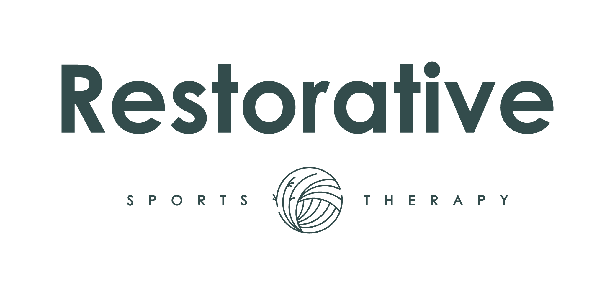
Our Brand - the meaning behind our logos.
Like everything in our practice - there is intention behind it. Our primary and clinical logo is our circular muscle flow. People comment on it and ask it’s meaning, and again just like everything in our practice- it was very intentional. This logo represents the total fusion between our body and the organic nature around us - it has three distinct parts.
First, the direction of the shapes of the grass flowing into the shapes of the muscle fibers represents a cyclical system - a symbol of the passage of time and seasonality leading to growth, in both mindset and physicality. Recognizing each person needs something different depending on what season of their life they are in.
Second- the left represents sweet grass which pays respect to my Metis roots and growing up near the sweet grass hills in Southern Alberta. This grass is indigenous to Alberta and is used widely in traditional healing ceremonies- it’s smoke thought to purify thoughts, eliminating the bad and or the negative ones. The right side of the logo represents the flow of our muscle fibers - our drivers for movement, they give us strength and physical integrity, and allow us to live the vibrant life we crave and deserve.
Lastly, you may have noticed the break in the edges of the circle, this represents the one-one-one model of Restorative Sports Therapy. Our visits start and stop with you only- making sure you feel heard and seen - giving us time to meet you where you’re at.
We have created an incredible space that specializes in private one therapist to one patient at a time visits. Theses two halves of our logo ultimately come together to create a full experience and a unity of mind and body into the healing process.
Our Restorative vision was brought to life by my incredible branding team Studio Millie. They are a group of incredible women who did just that- saw me, heard me, and felt the passion I had deep inside to serve people.
~Find your passion, find what moves you, find your strength in movement~

